


HS1 Ltd has undertaken in-depth research to help it improve the usability of information screens at St. Pancras International.
At HS1 Ltd, we know that the way our passengers are able to move round our station is a big part of their journey experience, and that at London’s St. Pancras International we run one of the most storied — yet at times tricky to navigate — passenger hubs.
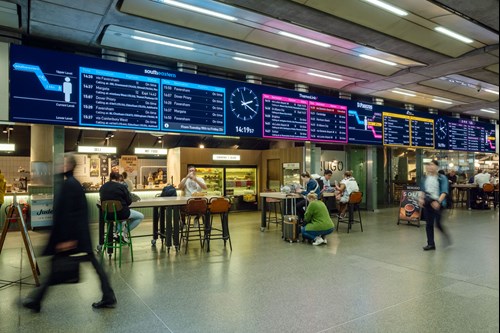
St. Pancras is a unique ‘4-in-1’ station for national and international rail services, with many platforms and no view of the trains from the main hall. It is therefore vital that we do everything we can to help people navigate. In our latest customer survey, ease of navigation came out as the third most important driver of satisfaction.
That’s why, as part of HS1 Ltd’s wider efforts to improve customer experience in all aspects of their rail journey, we recently completed an innovative research project into the usability of the information screens passengers use to find train platforms.
The aim was to see if we could take the tried and tested methods of design and make them work even better for our customers.
Five phases
Through five phases of work and research, we figured out the best way to improve the customer information screen design and layout.
Phase 1 saw our team conduct initial desk research to better understand screen design considerations and learn from similar projects in other sectors.
Phase 2 saw us conduct online ethnographic research, where users of St. Pancras were asked a series of questions and undertook activities — including video, image and text based tasks — to understand likes, dislikes and needs in relation to information screens based on a journey when customers travelled through St Pancras.
Phase 3 saw us, for the first time, develop concepts for how our new CIS infrastructure could look, based on our initial feedback and results from customer surveys. These were then tested in online focus groups across a representative sample of customer types. This then led to the final two phases of our work: concept evaluation, and in-situ customer feedback.
The evaluation work in Phase 4 saw the team at HS1 Ltd test six different options for the screens via online surveys, helping us quantify which screens were preferred and, crucially, why they were. For this, we used the MaxDiff technique, which shows respondents a set of items and asks them to rank them. This technique forces respondents to make a preferential choice which is more discriminating than an importance rating scale — giving us the results needed to build the screens.
Finally, after launching the screens, Phase 5 saw us conduct face-to-face customer surveys.
Results
We tested two types of screen with two different maps. One was a 2D map displaying train information including calling points, and the other a 3D map displaying no calling points. We found the first option was heavily favoured with 72% of people reporting that it was ‘very easy’ to find the information they needed for their train journey.
However, while this feedback highlighted how calling points makes it easier to identify the correct train to travel on, and is a feature that passengers notice when it is missing. But the feedback also showed that the 3D map was regarded by respondents as better for directing passengers to the platforms level and the various zones.
These twin findings helped us understand that the screen that our passengers would find most useful needed to be a third option, where the calling points on the main screen were included with a 3D version of the map, helping to guide customers through the station. The feedback also helped us understand that adding other languages, clearly understood labels, and colour coding for locations in the station and in relation to the train operator all were seen as useful additions that passengers would like to see incorporated.
The process we used to develop a new version of a ubiquitous piece of in-station equipment that many may take for granted was extensive. But the nature of the work, and the depth of engagement we had with passengers, helped us not only develop new CIS infrastructure to better inform passengers, but also provided us with a system to effectively engage with customers in the future on similar projects.
And the result? We have received lots of positive customer feedback across social channels, with customers particularly enjoying the simple, clean and colourful design.
So, as we begin to look at how our industry can bounce back from the aftermath of the pandemic, this research can help inform how we can improve customers’ experiences in our stations — and have more people choosing the railway as their preferred way to travel.
